
Designing for the Road: Creative Rules That Make Billboards Work
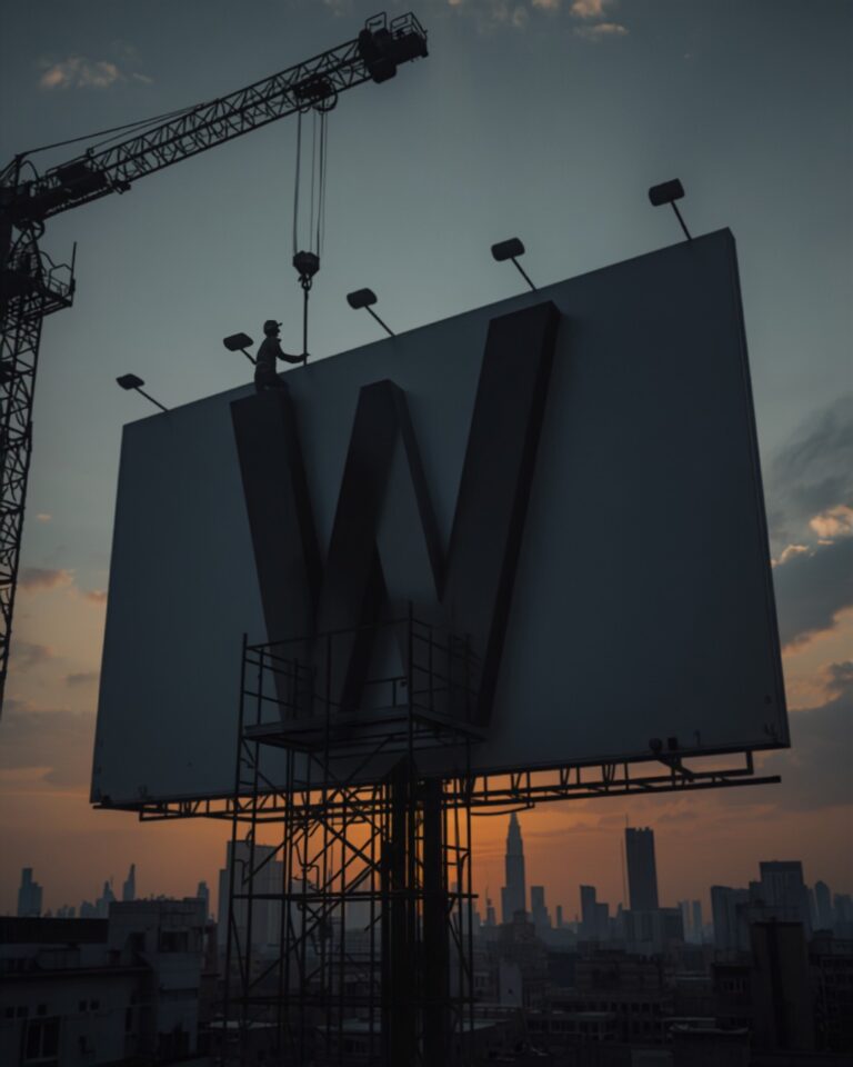
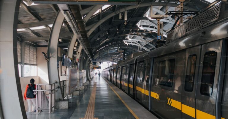
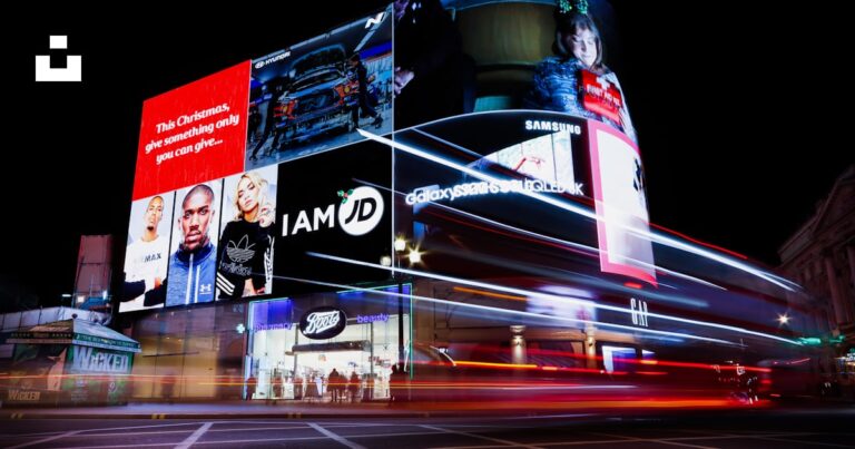
Outdoor creative has one job: to be understood in a glance. A driver on Sheikh Zayed Road or a commuter walking through a metro station gives a billboard a few seconds at most, so everything that does not serve the message has to go.
Keep the words to a minimum
Aim for a headline of around seven words or fewer. If the message needs a paragraph, it belongs on a landing page, not a hoarding.
One idea, one visual
A single strong image and a single message beat a collage every time. The brand should be recognisable even from a distance, so give the logo space and keep it consistent across every site.
Design for contrast and scale
High contrast between text and background, bold typefaces and generous sizing keep the message legible in bright sunlight, at night and at speed. Always review artwork at the size it will actually be seen from the road, not at full resolution on a monitor.
Make the next step easy
A short web address, a memorable handle or a simple instruction works far better than a long phone number. On pedestrian formats such as malls and metro, a QR code can bridge straight to an offer.
Adapt for each format
A unipole, a mall screen and a metro panel are viewed differently. Adapting the layout to each format, rather than stretching one artwork, keeps the campaign sharp everywhere it appears.
Our creative team designs campaigns built for the street. Get in touch to brief us.